AI Visibility Dashboard (the "AI Visibility Report" screen)
What this is for, in one sentence: this is your scoreboard — the four numbers that summarize how visible your brand is inside AI answers, across all five platforms, over time.
When to come here: whenever new results land. Zicy now tracks on a daily, weekly, or monthly view, so you can glance at day-to-day movement or step back to the longer trend. This is the screen you check when results update, the screen you screenshot for a boss, and the starting point for every “why?” question (the answers to which live in the Diagnose modules).
We continue with Sarah at MenuPilot. Her dashboard appears in Setting Up Zicy for the First Time (GS-01) — this article goes deeper on how to actually read it.
The four numbers, and how to judge them
Section titled “The four numbers, and how to judge them”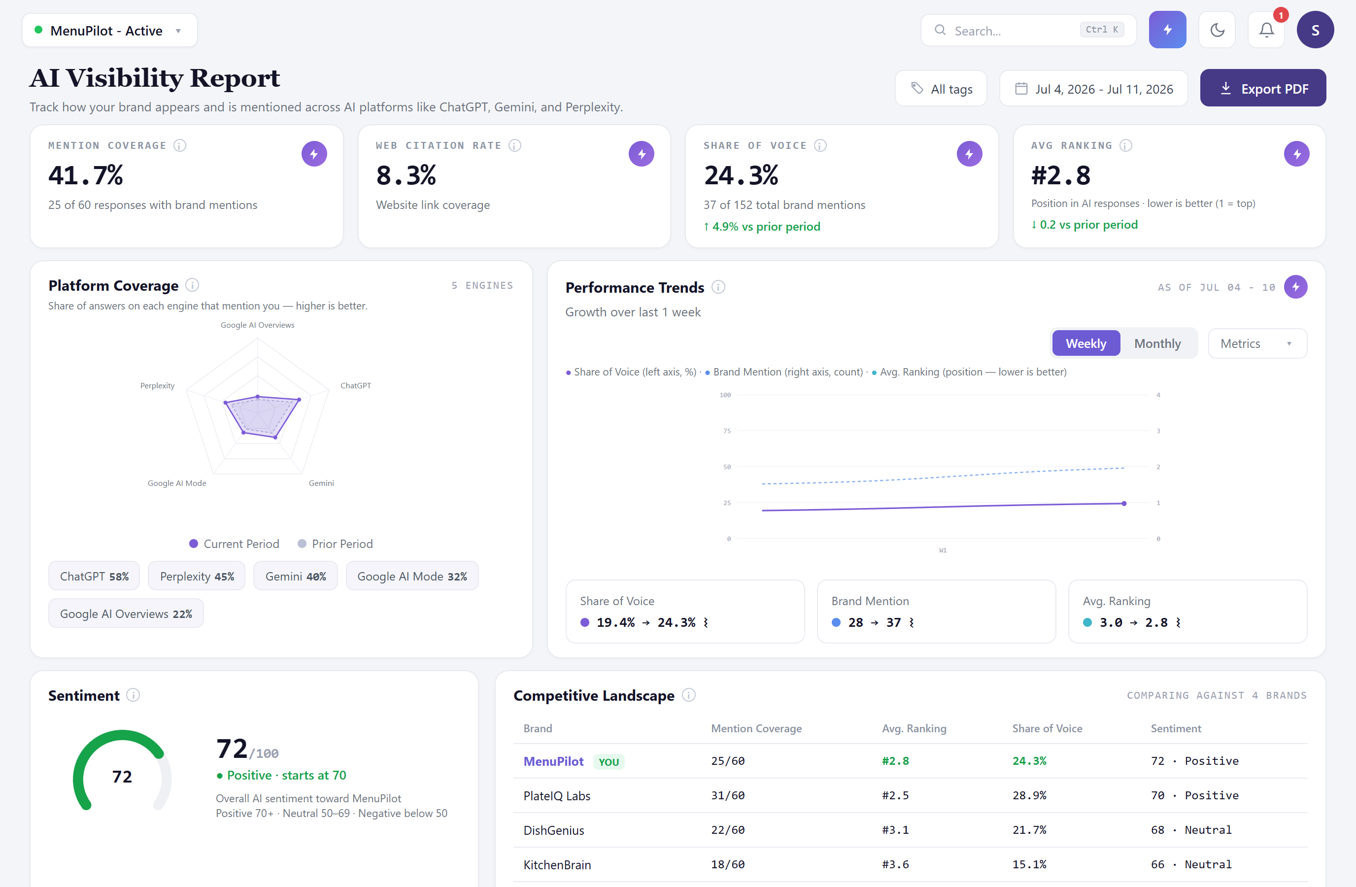
Each KPI card shows four things: the value, the count behind it, the change versus the prior period, and a plain-English benchmark chip — Good, Okay, or Needs work — so you get a read on the number without needing a data background. The one-line definition now sits directly under the number (no hunting required); the little “i” opens the fuller explanation:
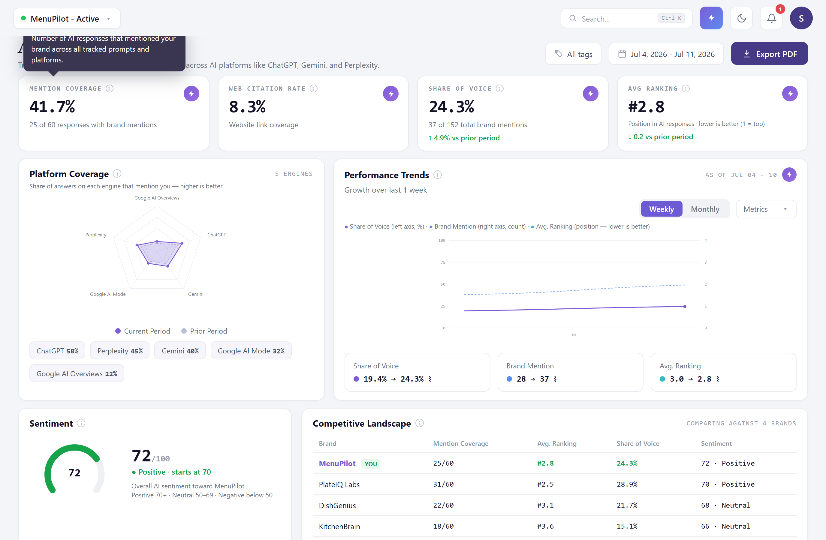
1. Brand Mention Coverage — % of AI answers that named you at all. Sarah’s 41.7% = 25 of 60 responses.
2. Web Citation Rate — % of answers that linked to your site. Expect this to be much lower than coverage — being named is common, being linked is rare. A citation rate at 1/3 to 1/5 of your coverage is a normal shape, not a problem. (Coverage and citation are two independent measurements — if they ever read exactly the same, that’s a small-sample coincidence, not one number copying the other.)
3. AI Share of Voice — your share of every brand mention across all answers. Sarah’s 24.3% = 37 of 152 mentions.
4. Average AI Ranking — your average position when AI lists options. Lower is better — and so a falling ranking number is good news. Sarah’s move from 3.0 → 2.8 is an improvement.
“But is my number good?”
Section titled ““But is my number good?””The benchmark chip on each card gives you the quick read. For the fuller picture, three comparisons mean the most:
- You vs. your competitors — the same numbers for your tracked rivals live on the Competitive AI Performance screen (M-05). Being at 41.7% coverage means little; being second of five brands means a lot.
- You vs. last period — direction beats level. A brand moving 20% → 30% is winning; a brand parked at 60% may be coasting on old strength.
- Coverage vs. Share of Voice together — high coverage + low share of voice = you’re often mentioned but rarely the star of the answer. That combination points you straight at Battlegrounds in Key Topics (M-09).
The radar chart (per-engine coverage)
Section titled “The radar chart (per-engine coverage)”The five-cornered chart shows your coverage on each platform. Lopsided shapes are normal — Sarah is strong on ChatGPT (58%) and weak on Google AI Overviews (22%). Rather than reading a lopsided radar as failure, read it as a targeting map: each engine trusts different sources, and the Citation Analysis module (M-10) shows which sources move the engine you’re weakest on.
Performance Trends — daily, weekly, or monthly
Section titled “Performance Trends — daily, weekly, or monthly”The trends chart plots your KPIs over time. Use the Daily / Weekly / Monthly toggle (top right of the panel) to change the grain:
- Daily — one point per tracking cycle, since Zicy now tracks daily by default. Best for spotting the effect of a launch or a PR hit quickly.
- Weekly — rolls the daily runs up into one point per week; smooths day-to-day noise for the cleanest view of a real trend.
- Monthly — the long arc, for reporting and reviews.
Two honest rules for reading trends, whichever grain you pick:
- Mark your events on the chart. The chart now supports event markers — click Add marker to note a campaign launch, PR push, or a prompt-set change, and Zicy also drops automatic markers for things like a prompt-set addition (you’ll see a note such as “Prompts added” on the relevant date). Connecting a metric move to a real-world action is the whole game — especially if you’ll ever need to prove a campaign worked.
- Keep your prompt set stable if you want a clean trend. Adding or removing prompts changes what’s being measured — numbers can jump purely because the questions changed, not because your visibility did. When Sarah added 3 pricing prompts, her blended numbers shifted; that’s composition, not performance. The auto-marker on that date makes the cause obvious at a glance.
The chart plots metrics on two clearly labelled axes — Share of Voice (%) on the left, Brand Mention (count) on the right — with a legend mapping each line to the axis it uses, so a line that looks like it disagrees with a percentage is simply reading the other scale.
Filters: slicing the dashboard
Section titled “Filters: slicing the dashboard”Date range — compare periods; the “vs prior period” deltas on the KPI cards follow your selection.
Tag filter — the payoff for tagging your prompts. Selecting a tag recalculates the entire dashboard in place for just those prompts, and shows the active filter as a removable chip:
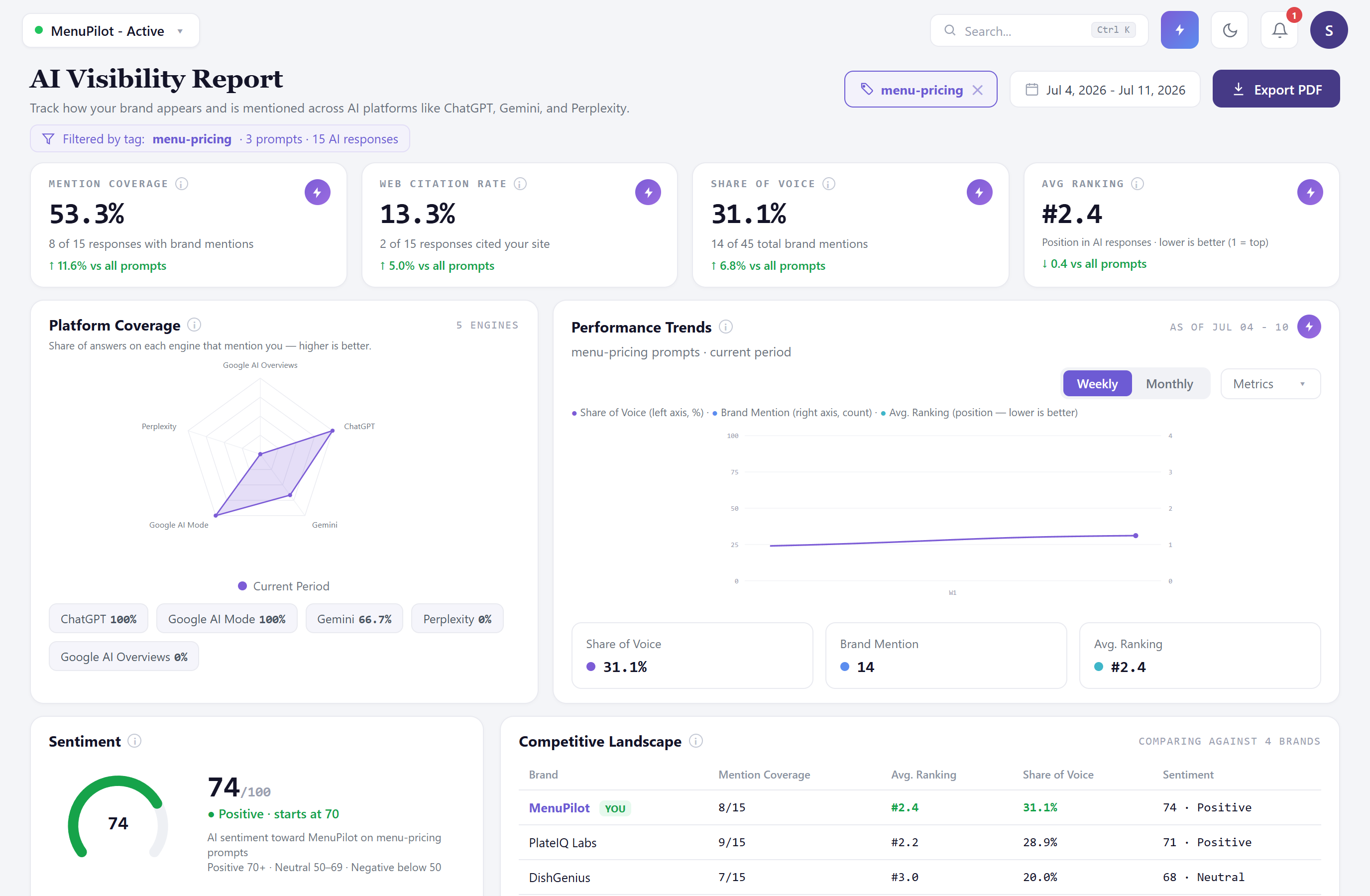
The blended dashboard says Sarah’s coverage is 41.7%; filtered to pricing questions only, it’s 53.3%. Same brand, different question sets, honestly different answers — this is how you find out where you’re strong instead of settling for one average. If your tags exist but this filter feels useless, your tags are too broad; see the tagging system in GS-02.
The sentiment dial and competitive panel
Section titled “The sentiment dial and competitive panel”The sentiment dial gives the one-glance answer to “does AI speak well of us?” (Sarah’s 72 · Positive). It only shows a verdict once there’s enough data to be fair — a brand-new or thinly-tracked profile reads “Not enough data yet” rather than a misleading red. The full picture — the exact words AI uses, positive and negative — lives in Brand Sentiment (M-07).
The Competitive Landscape panel previews you against your tracked rivals, with a “YOU” badge on your own row; the full head-to-head table is Competitive AI Performance (M-05).
Export PDF (top right) builds the board-ready report from what you’re looking at — covered in full in the Report Export article (M-15).
Common questions
Section titled “Common questions”My numbers jumped right after I added prompts — did something happen? Probably not in the market: you changed the measurement. New prompts change the mix of questions, so every blended number recalculates. Look for the automatic “Prompts added” marker on the trend chart at that date, and judge the new baseline after a stable period.
Average Ranking shows “—”. Broken? No — “—” means there were no mentions to rank in the selected period/filter. No mentions, no position. It fills in as soon as you’re named somewhere.
Should I read the daily or the weekly view? Daily is great for reacting quickly to a launch; weekly is the honest read of a trend. When in doubt, decide with weekly and investigate with daily.
Which number should I report to my boss? Lead with Share of Voice (the competitive one) plus its trend, then coverage. Better yet: export the PDF (M-15), which packages all four with plain-English definitions.
What to do next
Section titled “What to do next”- Numbers lower than a rival’s? See exactly where: Competitive AI Performance (M-05).
- Wondering which questions drive a number? Open the receipts: Per-Prompt Results (M-03).
- Ready to show someone? Report Export (M-15).